


As a business owner, you’re a “Chief Everything Officer.” You know your website is your #1 salesperson, working 24/7. But is it a good salesperson?
Most owners can “feel” when their website is failing. It looks “outdated,” “clunky,” or “confusing.” But “feel” doesn’t help you make a business decision. You need a simple, logical way to analyze your site’s design—and your competitors’—to find the gaps that are costing you money.
You don’t need to be a designer to do this. You just need a framework.
A professional web design and development agency uses complex frameworks, but it all boils down to answering three questions. We call it the “3C Framework,” and you can use it right now to analyze any website in 5 minutes.
Key Takeaways
| Problem | Action |
Outcome |
| You “feel” your website is outdated or ineffective, but you can’t pinpoint why. | Use a simple “3C” framework: analyze for Clarity, Credibility, and Conversion. | You can identify specific, actionable problems instead of just saying, “I don’t like it.” |
| You’re not a designer, so terms like “UX/UI” and “CRO” are confusing. | Learn to analyze UX by asking “Is it easy?” and CRO by asking “Is it obvious what to do next?” | You can have an intelligent, ROI-focused conversation with your design agency or marketing team. |
| Your website gets traffic but few leads or sales. | Perform a “Conversion Audit” by identifying your #1 Call-to-Action (CTA) and seeing if every page supports it. | You can discover key friction points that are costing you money and make simple changes to improve your conversion rate. |
| You’re not sure how your site compares to your top competitor. | Analyze your competitor’s site using the same 3C framework. Identify where they are weak and you can be strong. | You gain a clear competitive advantage by building a site that is more credible and easier to use than the competition. |
What are the key elements of a good website design?
Forget “pop” and “wow factor” for a second. A website design is good if it successfully does three jobs:
- Clarity (Is it easy to understand?)
- Credibility (Is it trustworthy?)
- Conversion (Is it built to take action?)
That’s it. If a site is confusing, untrustworthy, or has no clear next step, it has failed—no matter how “pretty” it is.
What is a website design audit checklist? (The 3C Framework)
Here is a simple HowTo guide for analyzing any website. Grab a pen and open your homepage.
Step 1: The Clarity Audit (UX & UI)
This is the “5-Second Test.” Can a brand new visitor understand what you do and where to go in 5 seconds?
- What is this? (Headline): Is there a single, clear headline “above the fold” (before you scroll) that explains what you do and for whom?
- Bad: “Synergistic Solutions for a New Generation.” (What?)
- Good: “Hassle-Free Payroll for Small Businesses.” (Clear.)
- What’s in it for me? (Value Prop): Does the site quickly communicate the benefit of your product or service?
- Where do I go? (Navigation): Look at the main menu. Is it simple (5-7 items max) with obvious labels? Or is it a 15-item “mega-menu” of confusing jargon? This is the core of good User Interface (UI).
Step 2: The Credibility Audit (Trust)
People do business with people they trust. Your website design is the new “handshake.” Does it inspire confidence?
- Authenticity (Photos): Are the photos real pictures of your team, office, or products? Or are they the same generic stock photos your competitor is using? Real photos build instant trust.
- Social Proof (Testimonials): Are there real reviews from real clients/customers? Are they specific? “They increased our leads by 40%” is better than “Great service.”
- Professionalism (Visuals): Does the site look modern and clean, or is it from 2005? This includes:
- Consistent colors (a defined 2-3 color palette).
- Readable fonts (no tiny grey text).
- Lots of “white space” (room for content to breathe).
- Accessibility (Trust for All): Is the text readable? Are the colors high-contrast? We’ll cover this more in the technical check.
Step 3: The Conversion Audit (CRO)
This is the “money” step. A website without a conversion goal is a hobby, not a business asset. Conversion Rate Optimization (CRO) is the art of making the next step obvious.
- The #1 Goal (CTA): What is the one thing you want a user to do? Is it “Schedule a Call,” “Buy Now,” or “Download a Guide”?
- The “Obvious” Test (Buttons): Is that Call-to-Action (CTA) a bright, high-contrast button that stands out? Or is it a blue text link buried in a paragraph?
- Friction (Forms): Look at your contact form. Are you asking for 12 fields of information? Or can you get by with just “Name, Email, and Message”? Every extra field you ask for loses you a percentage of leads.
How do you evaluate a website’s User Experience (UX) and User Interface (UI)?
People use these terms as buzzwords. Here’s the simple difference:
- User Interface (UI): This is the look. Is it pretty? Are the colors and fonts consistent? This is part of the “Clarity” and “Credibility” audit. A good UI is clean, modern, and branded.
- User Experience (UX): This is the feel. Is it easy to use? Is the navigation logical? Does the checkout process make sense? UX is the entire journey.
You evaluate UX by asking, “How easy was that?” If a user has to think about where to click, your UX is failing. The best UX is intuitive—you don’t even notice it.
How do you analyze a website’s design for conversion rate optimization (CRO)?
This is the “Conversion Audit” (Step 3) in more detail. To analyze for CRO, you must follow the “scent” of the conversion.
- Identify the CTA: Find the main “Schedule a Call” button on the homepage.
- Click It: Where does it go? Does it go to a simple, clear contact page?
- Analyze the Form: Is the form simple? Does the page re-assure the user (“We’ll respond in 24 hours”)?
- Find the Friction: Is the button broken? Does the page load slowly? Is the form too long? Do you get a success message after?
You’re looking for any reason a user would give up and leave.
What frameworks can be used for a website design analysis?
For our “Chief Everything Officer” audience, the “3C” (Clarity, Credibility, Conversion) framework is the most practical.
The “professional” term for a deep analysis is a “Heuristic Evaluation.” This is a set of 10 usability “rules of thumb” (heuristics) developed by experts. It’s a more formal process where an analyst checks the site against principles like “User control and freedom” and “Consistency and standards.”
For your purposes, the 3C framework is a simplified, ROI-focused version of a heuristic evaluation.
Technical Checks: Mobile-Friendliness & Accessibility
A great design can be ruined by a bad technical foundation.
How do you analyze a website’s mobile-friendliness and responsiveness?
Don’t just trust your developer. Do it yourself.
- Open your website on your phone.
- Is the text tiny? Do you have to “pinch and zoom” to read it? That’s a fail.
- Is the navigation menu easy to open and tap with your thumb?
- Are the buttons large enough to tap, or are they clustered together?
- How fast does it load on a 5G or WiFi connection? Use Google’s PageSpeed Insights tool for a free, detailed report.
A site that’s not “mobile-first” is losing over 60% of its potential audience.
How do you check a website’s accessibility (e.g., WCAG compliance)?
Accessibility means making your site usable for people with disabilities (e.g., vision impairment). It’s not just a good idea; it’s a legal and ethical necessity (and it helps your SEO).
- The Color Test: Use a free “Color Contrast Checker” tool online. Plug in your main text color and your background color. Is the contrast ratio high enough?
- The Keyboard Test: Can you navigate your site using only the “Tab” key? A user should be able to “tab” from link to link.
- The Alt-Text Test: Do your images have “alt-text”? This is the text that describes an image for screen readers (and Google).
What tools can you use to analyze a website’s design?
You can do 90% of your analysis with just your eyes and the 3C framework. But these tools speed it up.
- Google PageSpeed Insights: (Free) Tells you how fast your site loads on mobile and desktop and gives you a “Core Web Vitals” score.
- Hotjar or Microsoft Clarity: (Free/Freemium) These tools create heatmaps (to see where users click) and session recordings (to watch real users browse your site). This is the best way to find UX problems.
- WAVE Web Accessibility Evaluation Tool: (Free) A browser extension that scans your site for accessibility errors like low contrast or missing alt-text.
Frequently Asked Questions (FAQ)
What is the first thing to look at when analyzing a website?
The “5-Second Test.” Open the homepage and see if you can answer three questions in 5 seconds:
- Who is this for?
- What do they do?
- Why should I care?
If you can’t, the site has a “Clarity” problem.
How is website analysis different from a website audit?
Think of it as a checkup vs. a full physical.
- Analysis (what you just learned): A qualitative, strategic review of the design’s effectiveness (UX, UI, CRO).
- Audit (a deeper dive): A comprehensive technical review. This is where an SEO expert or developer digs into the code, site structure, link profile, and server setup. Our analysis framework is the first step of a full audit.
How do you analyze a competitor’s website design?
You use the exact same 3C framework!
- Clarity: Is their messaging clearer than yours?
- Credibility: What trust signals are they using? (e.g., “As seen in…”, video testimonials). Can you do it better?
- Conversion: What is their main Call-to-Action? Is it more compelling than yours?
This process reveals all their weaknesses and gives you a roadmap to beat them.
What is a “heuristic evaluation” in website design?
It’s a formal method for finding usability problems in a design. An expert (a UX designer) checks the site against a list of 10 established “usability heuristics” (or rules of thumb) to identify where it might be confusing or frustrating for a user.
How can I tell if a website design is outdated?
- It’s “Full-Width”: The content (text, images) stretches all the way to the edges of your large desktop screen. Modern sites use a “boxed” or “contained” layout.
- It’s Not Mobile-Friendly: You have to pinch and zoom on your phone.
- Outdated Visuals: You see tiny, low-quality images, “glowing” text, or drop-shadows on everything.
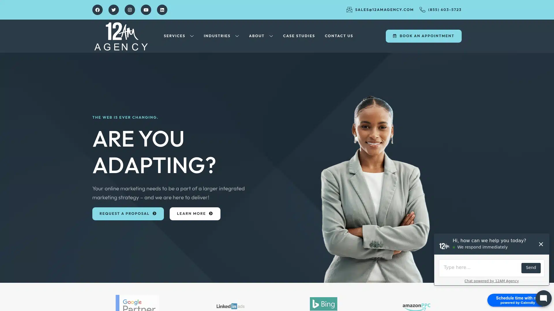
- It’s Full of Stock Photos: You see the same smiling “woman in a headset” that’s on 10 other sites.
From Analysis to Action
Analyzing your website design is the first step. The second is taking action.
You’ve now got a framework to find the “leaks” in your website. You can see why you’re losing customers on the contact page or why your competitor’s site feels more trustworthy.
A website isn’t a “set it and forget it” brochure. It’s an asset that needs to be tuned, optimized, and aligned with your business goals.
If your analysis reveals that your site has a “Clarity,” “Credibility,” or “Conversion” problem, it’s not a failure—it’s an opportunity. We’re 12AM Agency, and we turn those opportunities into case studies.
[Ready for a professional audit? Talk to a 12AM strategist today.]