

You have invested thousands in SEO. Your traffic is climbing. But your phone isn’t ringing.
Why?
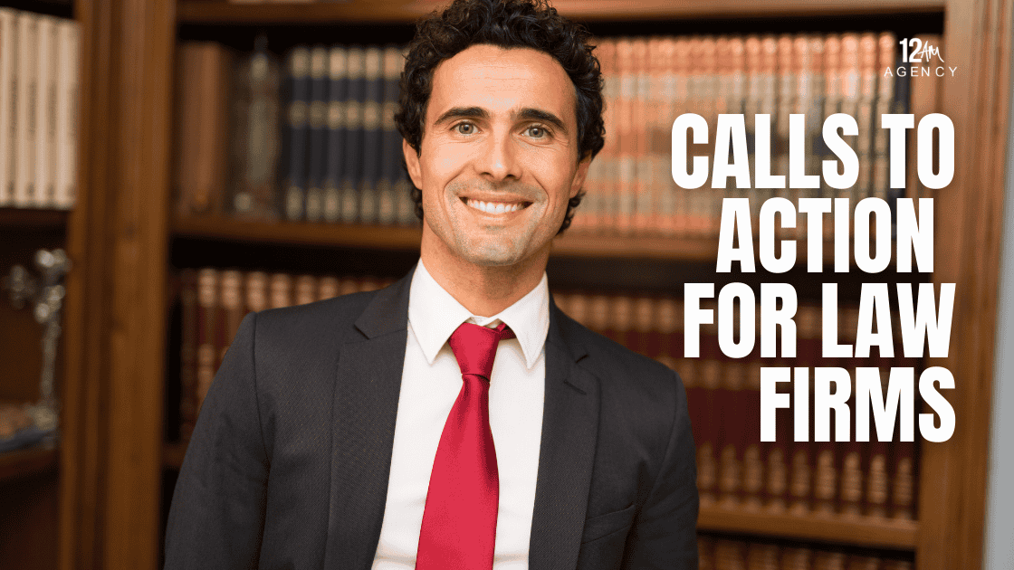
The problem often isn’t your traffic; it’s your “ask.” For the Chief Everything Officer of a law firm, the humble Call to Action (CTA) button is the most critical pixel on the screen. It is the tipping point between a browser and a lead.
Yet, 90% of law firm websites rely on the same tired, low-converting phrase: “Free Consultation.”
In 2025, clients are savvy. They know a “consultation” is often code for a sales pitch. To capture high-intent leads in a competitive market, you need to upgrade your language, your psychology, and your design.
This guide covers the tactical calls to action for law firms that move the needle from “browsing” to “retained.”
Key Takeaways
| Problem | Action |
Outcome |
| “Free Consultation” Fatigue: Prospects view this as a sales pitch, not help. | Switch to value-first phrasing like “Get Your Free Case Evaluation” or “See What Your Case is Worth.” | Lower barrier to entry and increased click-through rates (CTR). |
| Hidden Contact Forms: Users have to scroll or click multiple times to find a way to contact you. | Implement Sticky Headers and “Breadcrumb” forms. | Immediate access leads to higher conversion on mobile devices. |
| Generic “Submit” Buttons: Default button text creates friction. | Use First-Person Affirmations like “Start My Claim” or “Protect My Rights.” | Psychological alignment increases form completion. |
Why “Free Consultation” is the Weakest CTA in 2025
Words matter. When a user sees “Free Consultation,” they subconsciously anticipate friction. They imagine scheduling conflicts, driving to an office, or being pressured to sign a retainer. It feels like work.
Your CTA should feel like relief.
Effective calls to action for law firms focus on the benefit to the user, not the process of the lawyer.
- Weak: Call for a Free Consultation (Process-focused)
- Strong: Get Your Free Case Review (Value-focused)
The shift is subtle but powerful. “Case Review” implies you are giving them an answer or an asset, rather than asking for their time.
High-Converting Alternatives: “Get Your Case Evaluation” vs. “See What It’s Worth”
Different practice areas require different psychological triggers. A corporate client has different needs than an injury victim.
For Personal Injury (Greed/Compensation)
The user wants to know if they have a payday coming.
- “See What Your Case Is Worth”
- “Calculate My Potential Settlement”
- “Get My Free Injury Report”
For Criminal Defense (Fear/Urgency)
The user is scared and wants immediate protection.
- “Protect My Rights Now”
- “Stop The Charges”
- “Speak to an Attorney in 5 Minutes”
For Family Law (Clarity/Resolution)
The user is emotional and wants a path forward.
- “Start My New Chapter”
- “Discuss My Custody Options”
- “Get the Divorce Guide”
By matching the CTA to the specific emotion of the searcher, you validate their intent instantly.
“Breadcrumb” Forms: Increasing Leads by Asking Small Questions First
If you present a user with a form asking for their Name, Email, Phone, Address, Case Details, and Mother’s Maiden Name, they will bounce. That is too much commitment too soon.
Enter the Breadcrumb Technique (or Multi-Step Form).
How It Works
- Step 1: Ask a low-threat question. e.g., “What type of accident happened?” (Buttons: Car, Truck, Slip & Fall)
- Step 2: Ask for a slightly more personal detail. e.g., “Were you injured?”
- Step 3: Ask for contact info to “Get the Results.”
Why It Wins:
Psychologically, once a user clicks the first button (a “micro-conversion”), they are committed to finishing the process. This creates a “Sunk Cost” effect that skyrockets conversion rates—often by 50% or more compared to static forms.
To implement this, you need a website built for performance. Our Web Design and Development services specialize in integrating these high-conversion funnels.
The Psychology of Color and Placement for Button Design
“Make the button red” is simplistic advice, but contrast is non-negotiable.
The Squint Test
If you squint at your website until it’s blurry, does your CTA button stand out? If it blends into your hero image or matches your navigation bar too closely, it is invisible.
- Color: Use a complementary color to your brand palette. If your site is Navy Blue, an Orange or Gold button pops.
- Shape: Rounded corners generally perform better than sharp rectangles; they draw the eye inward.
- Whitespace: Give your button room to breathe. Clutter kills conversion.
Sticky Headers and Mobile CTAs: Best Practices for Phones
Over 60% of legal searches happen on mobile devices. If your potential client has to scroll back to the top of the page to find your phone number, you have lost them.
The “Sticky” Solution
Your mobile header should “stick” to the top of the screen as the user scrolls down. It should contain two distinct buttons:
- Click-to-Call (Icon): For immediate urgency.
- “Get Help” (Text): Triggers a modal form or anchors to the contact section.
This ensures that the moment the user decides to act—whether they are reading the first paragraph or the conclusion—the button is literally under their thumb.
Contextual CTAs: Matching the Ask to the Blog Topic
A common mistake is using the exact same CTA on every blog post.
- If the blog is about: “What to do after a car accident.”
- Generic CTA: Contact us for help.
- Contextual CTA: “Download our 5-Step Accident Checklist PDF.”
- If the blog is about: “How much does a divorce cost?”
- Generic CTA: Call our office.
- Contextual CTA: “Request a Fee Structure Breakdown.”
Contextual CTAs feel like a helpful “Next Step” rather than an interruption.
Using Urgency Without Sounding Desperate or Unethical
False urgency (e.g., “Offer expires in 10 minutes!”) is unethical for lawyers and violates bar rules in many states. However, you can use legitimate urgency related to the user’s situation.
- Statute of Limitations: “Your time to file a claim is limited by law. Check your deadline now.”
- Evidence Preservation: “Evidence disappears quickly. Let our team secure the scene today.”
This type of urgency educates the client on why they need to act fast, rather than just pressuring them to click.
Frequently Asked Questions
How many CTAs should be on a landing page?
Generally, you want one primary goal (e.g., Fill out the form). However, you should repeat the CTA 3–4 times on a long page: once in the header, once after the intro, once in the middle value section, and once at the end.
Should I put my phone number in the header?
Yes. Absolutely. For law firms, phone calls are often higher value than form fills. Make it large, visible, and clickable.
What is a good conversion rate for a law firm website?
The industry average hovers around 2–3%. High-performing sites with optimized CTAs and breadcrumb forms can see rates between 8–12%.
Does “Chat Now” work better than a contact form?
It depends on the user. Younger demographics prefer Chat. Older demographics prefer phone or email. The best strategy is to offer both options (a form and a chat widget) to capture different preferences.
Conclusion
Your website is not a digital brochure; it is a 24/7 salesperson. If that salesperson is mumbling “Free Consultation” quietly in the corner, you are leaving money on the table.
By testing specific calls to action for law firms, implementing breadcrumb forms, and matching your “ask” to the user’s intent, you can transform your traffic into a steady pipeline of cases.
Ready to turn your website into a conversion engine?
At 12AM Agency, we design legal websites that don’t just look good—they convert. Would you like a free Conversion Audit of your current site to see where you are losing leads?